One challenge any community site faces is how to let users express themselves. It is hard to express the sum total of any individual on a web page, but in the virtual world that interface is the one chance a user has to connect with another human being. The challenge for designers is making the profile look good. In most instances the profiles end up cluttered and in the MySpace instance where users are allowed to customize the look of their profile the site ends up with some of the ugliest pages ever created. However, I’m not convinced that is a fault in their system. If you look at most teenagers rooms they would likely qualify as a superfund cleanup site. Their online profiles reflect that.
The following is a list of profiles from all types of social networks. Some are general networks like Facebook. Others are niche networks like Bakespace. One thing I find interesting is how each niche site tries to let the user express themselves in a way that is unique to the site. For example, Genlighten has a genealogy slant and the profile reflects the users actions in that space. That is a critical feature for any site that has a particular focus else why not just use our Facebook (or other similar network) as our global profile on every site. The unique attributes like recipes or genealogy societies are key to success for focused networks. The images do a much better job conveying the message from each site so have a good time looking through them. Look for a future post on how networks help with user discovery and search.
YouTube has an obvious focus on videos for the users profile.

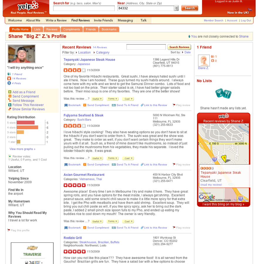
Yelp has a focus on the user’s activity within the site – mainly the reviews they provide. Profiles can potentially be a way to encourage user behavior

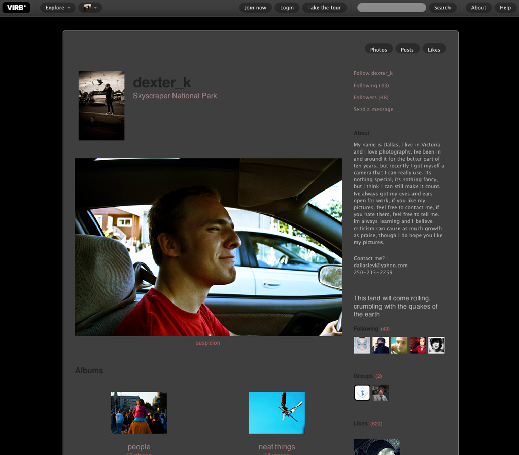
Virb has a simple profile with the social basics – photos, followers, likes, and then a stream of text.

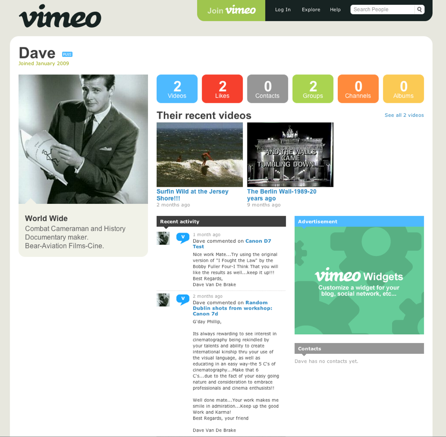
Vimeo has an obvious focus on the videos contributed by a user but also includes, user activity and their contacts.

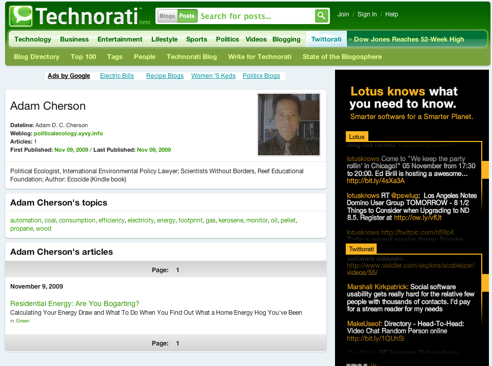
Technorati Let’s each user add a personal blurb and then lists the user’s claimed blogs. You’ll also see a list of tags related to the topics generated by the user which makes sense since Technorati is all about the blogs your produce.

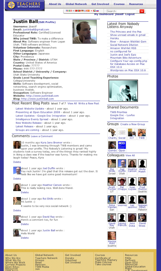
Teachers Without Borders I have to take responsibility for this design. The focus is on user activity with boxes of stuff like documents, colleagues, groups, etc on the side. Since I built it the original intent was to help teachers connect with one another using the content they produce.

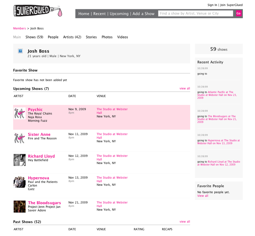
SuperGlued is about concerts. The profiles reflect that focusing on the shows a users has attended and will attend.

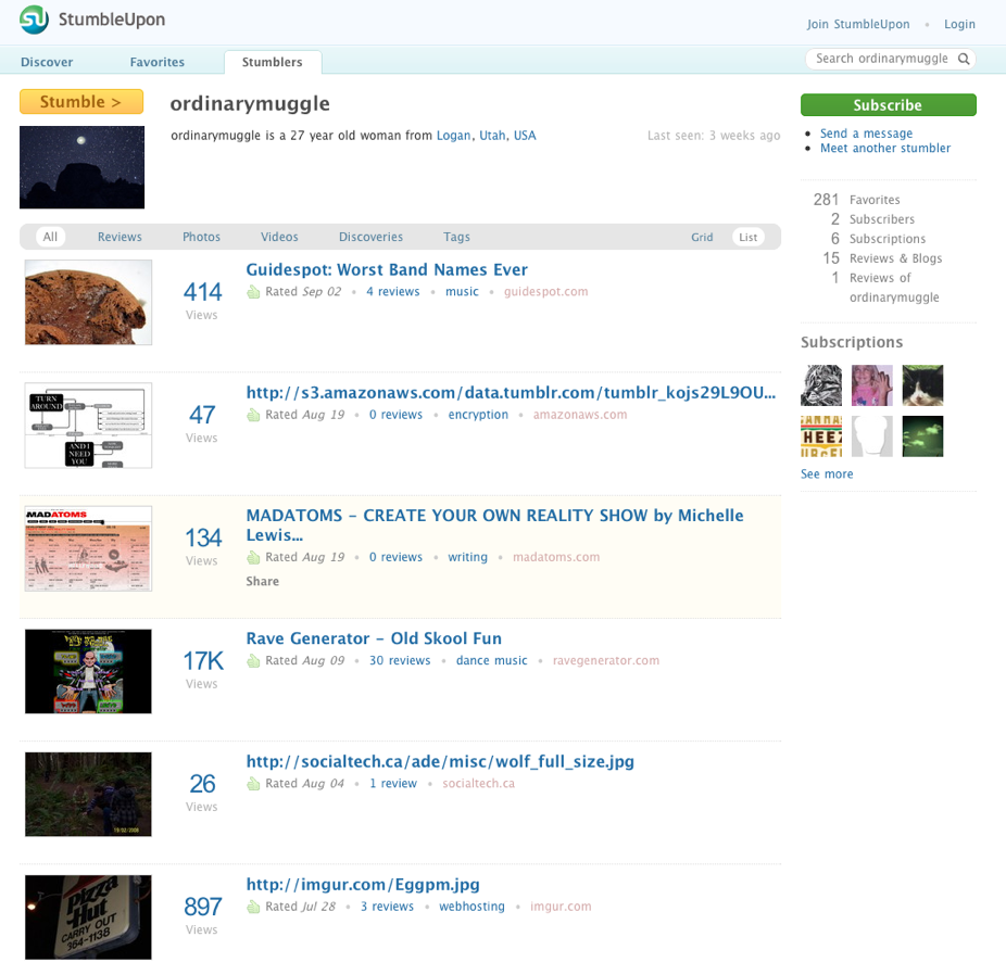
StumbleuponShows the stuff you’ve been stumbling. The profile is clean stays focused on the site’s main value.

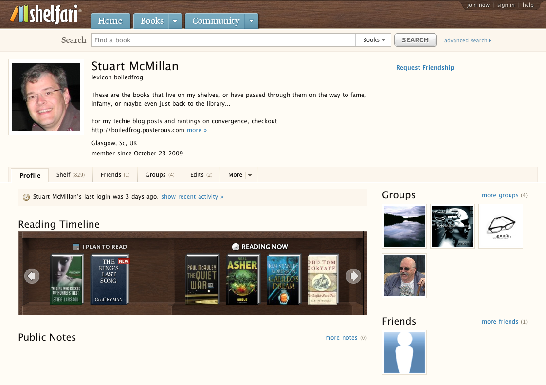
Shelfari presents the user’s books, groups, friends and a stream of comments.

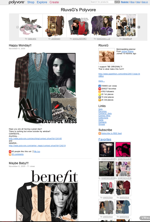
Polyvore let’s users express their fashion sense. I’m an engineer so I don’t hang out here.

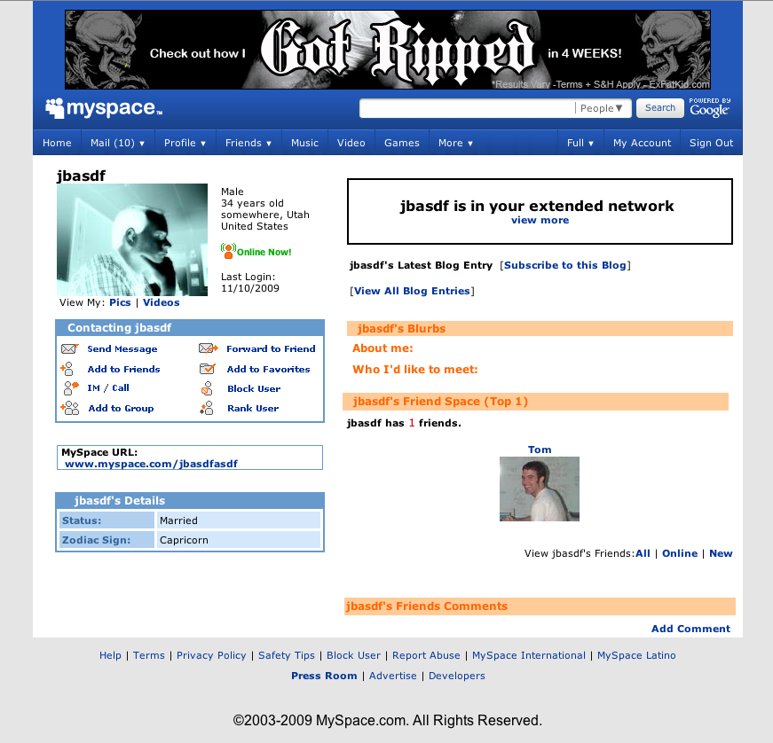
MySpace has to have the largest concentration of ugly found anywhere on the internet. I took a shot of my profile which has nothing in it because it was easier then trying to find a profile that I could comfortably post on my blog. I give them credit because users love the chance to create ugly but MySpace feels like the ultimate internet ghetto.

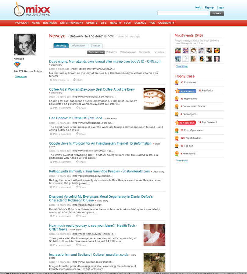
Mixx is about sharing links and so the profile shows that. It also includes links to friends. Interestingly enough Mixx also has a ‘Trophy Case’. Here they are trying to encourage user behavior with achievements. I’d actually love to know how well that works.

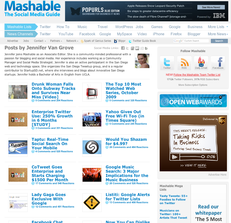
Mashable has profiles for their authors. Each author builds their identity by the content they produce.

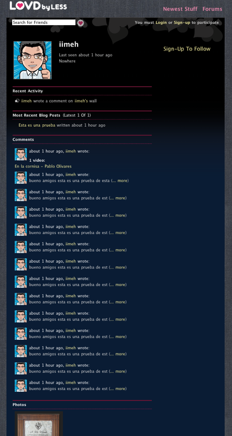
LovdByLess focuses on user activity with recent activity, blog posts, photos and comments.

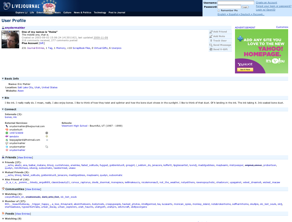
Livejournal has a profile system for their users. The focus of the system is on blogs not on the profiles so I’m guessing not a lot of users find their way here. The profiles aren’t pretty but they do provide a fair amount of information about the blog posts the user is generating.

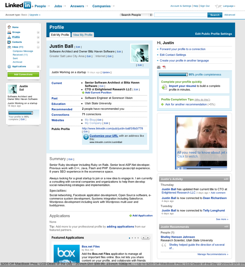
LinkedIn has a great deal more information than most networking sites probably because it’s professional intent. Your profile here reflects your career and is basically a dynamic resume.

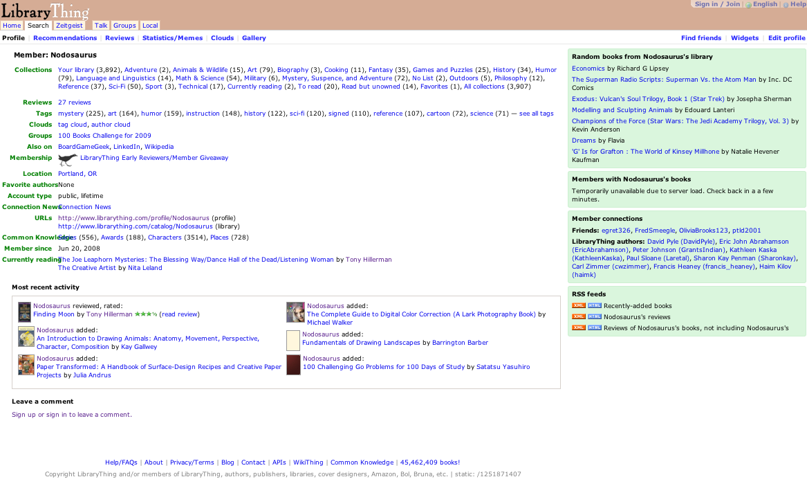
LibraryThing provides a link to your library, a list of tags and lots of space to write about yourself. It is a bit more sterile than say Shelfari, but the profile provides a great deal of information which ultimately will lead you to users with similar literary interests.

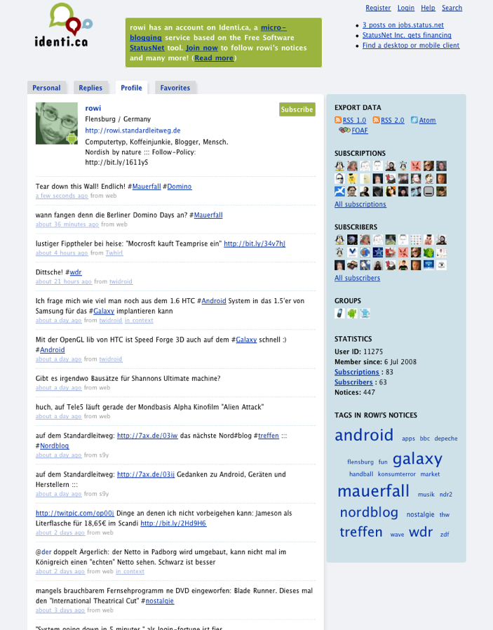
Identica is a Twitter like platform. The profile is, like Twitter, a list of information coming from the user and a list of people they follow.

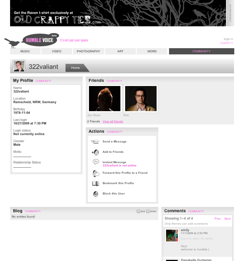
HumbleVoice is a community of artists. The profiles tend to be a bit disorganized but contain the usual interests, about me, friends and photos.

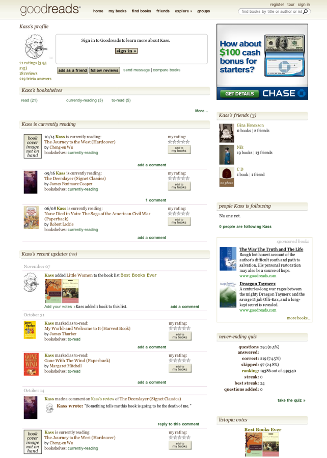
GoodReads has a bookshelf, friends, and updates.

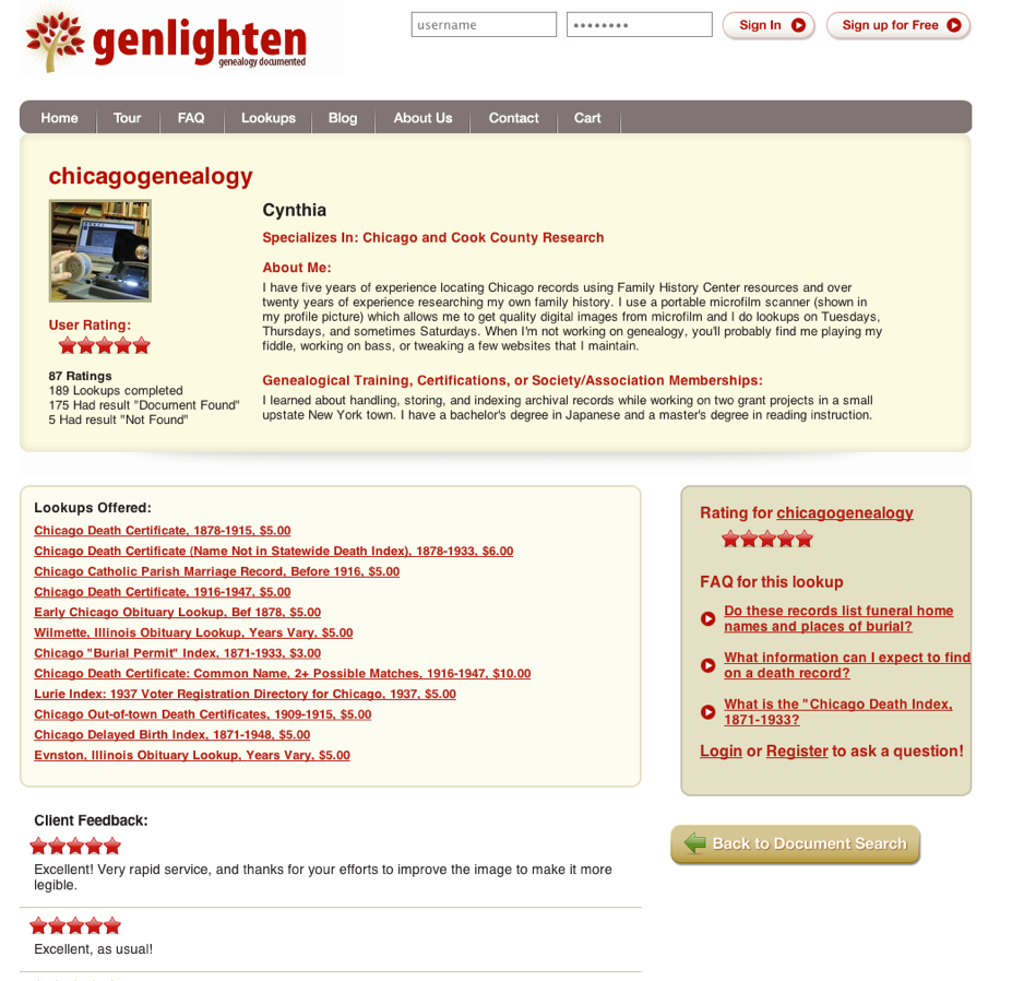
Genlighten is a genealogy community of record lookup providers. The profile reflects the goals of the site which is to help the provider make contact with those in need of their services. (I build this one too. However, I can’t claim the design that was done by Slice of Lime in Colorado).

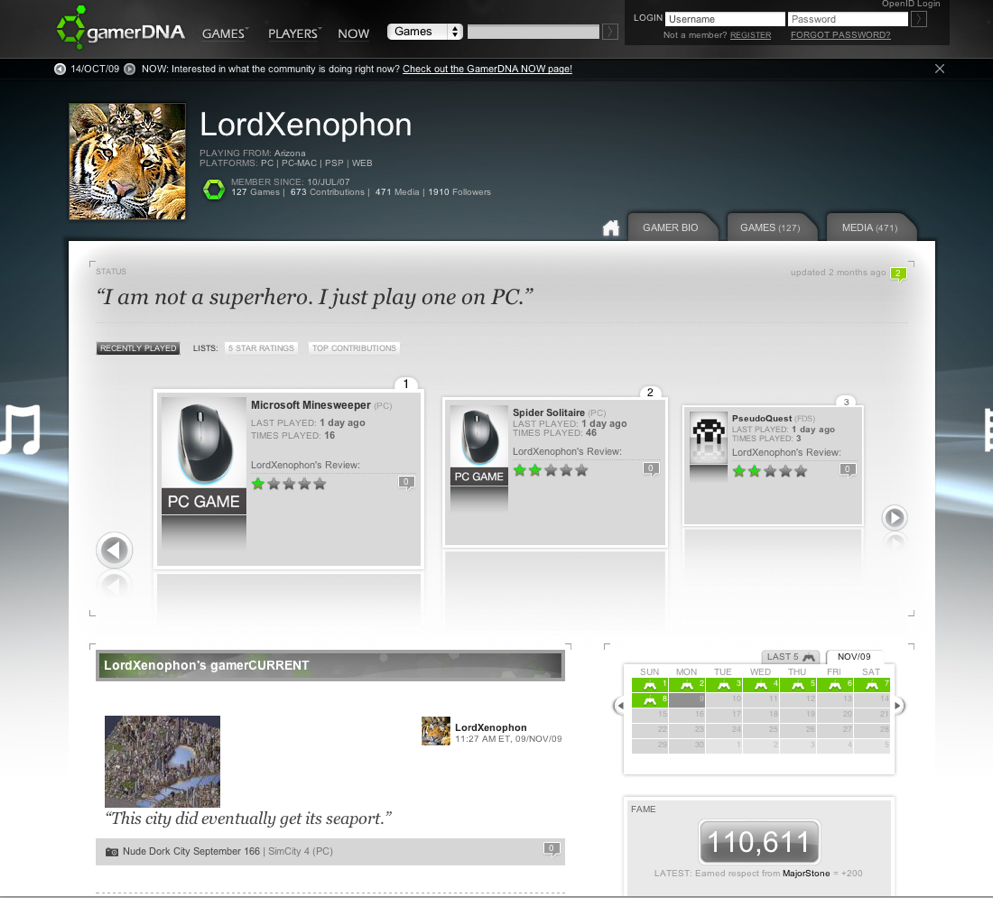
gamerDNA shows game accomplishments and uses the profile as a way to let the user show their video game identity.

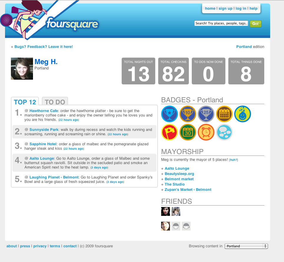
foursquare shows badges to encourage user behavior. They also include tips (which they want users to contribute) as well as a list of friends. The profile isn’t flashy but it’s clean.

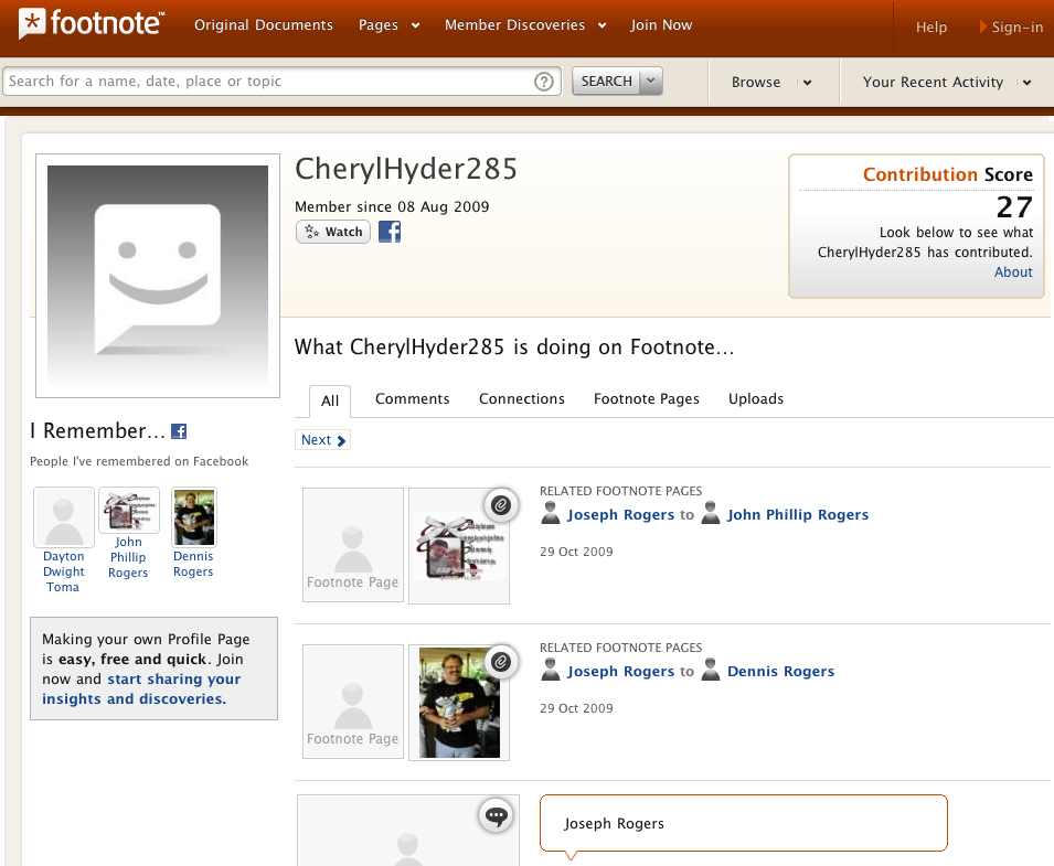
Footnote highlights user discoveries (document and image contributions).

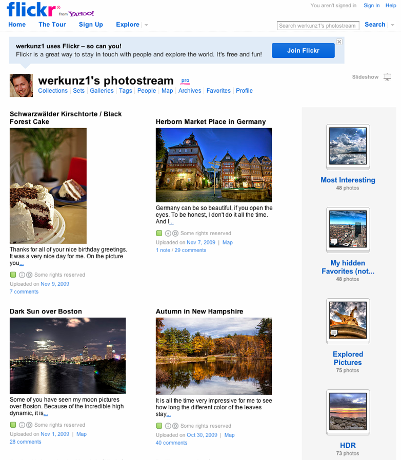
Flick highlights the user’s photos on their profile. They’re a photo site so no need for anything else.

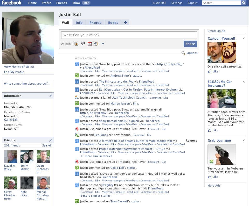
Facebook has one of the most recognized profiles of any site on the web. It is clean and highlights attention metadata. I think that is a key contribution of Facebook to the social world. They keep track of what you are doing without you having to do anything.

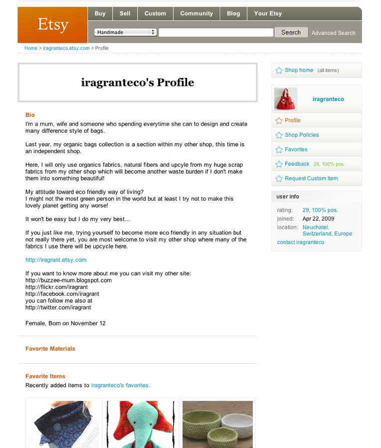
Etsy is the ultimate hand crafted stuff site. The profile reflects the sellers items and provides a simple text space where they can say anything they like.

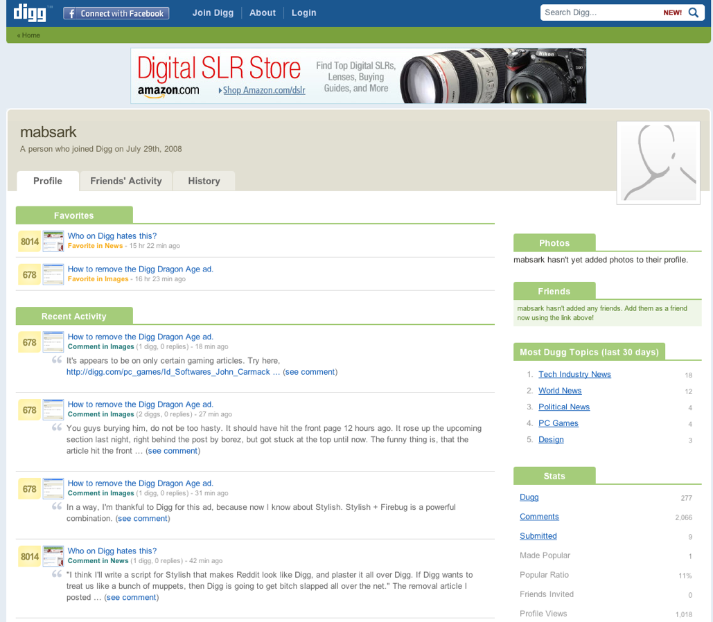
Digg shows what you’ve been digging. You need more?

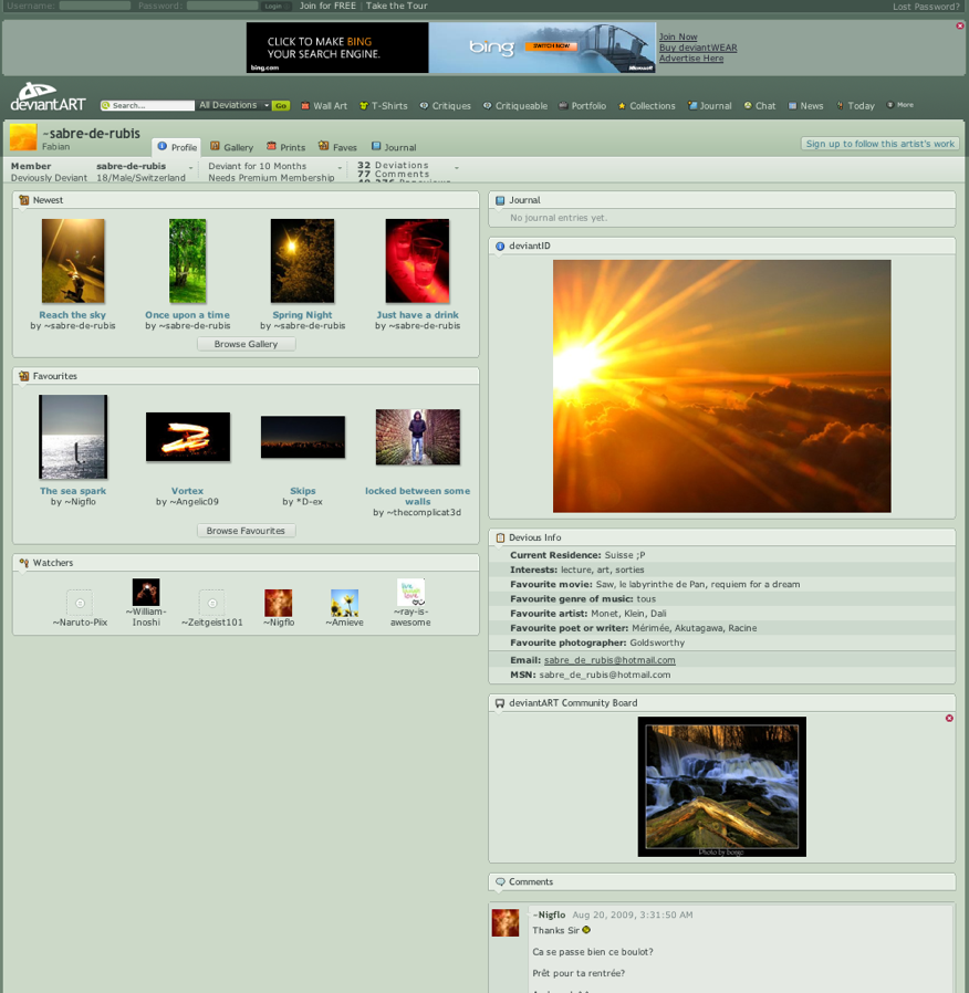
deviantART shows stuff from the artist, a bit of information, and let’s them provide a profile picture. The profile also has comments.

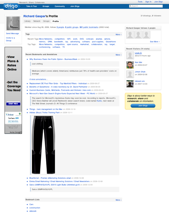
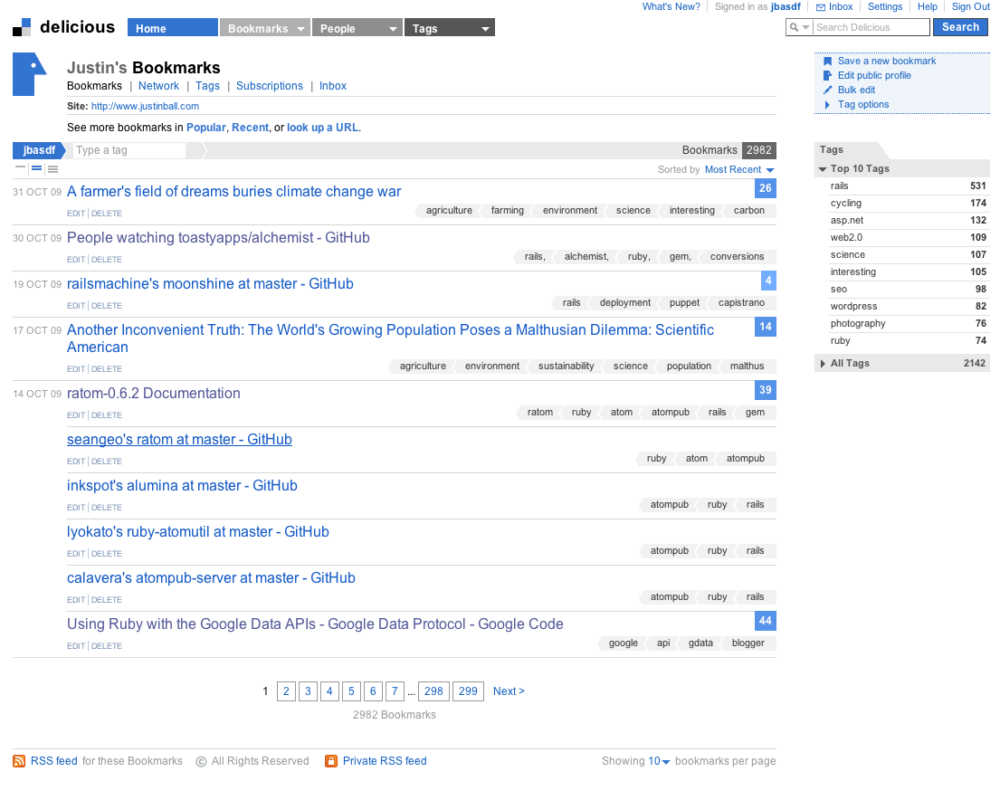
Delicious shows your bookmarks.

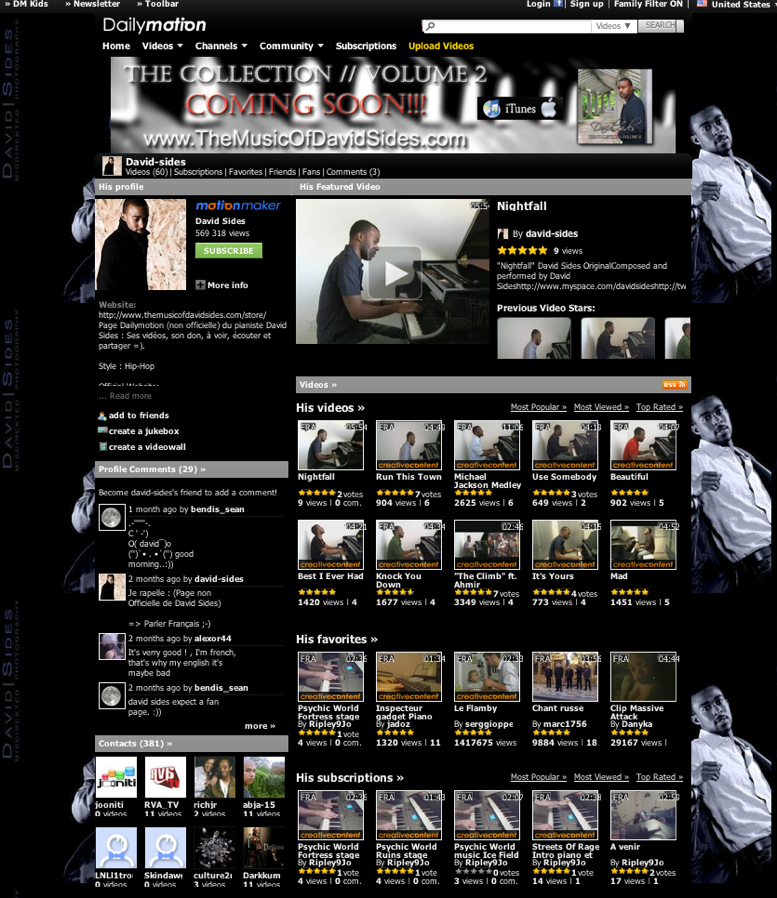
Dailymotion is a video site, but the profile lists groups, contacts, comment, favorites and playlists along with videos.

CommunityEngine is a Ruby on Rails plugin that can add social networking to your existing website.
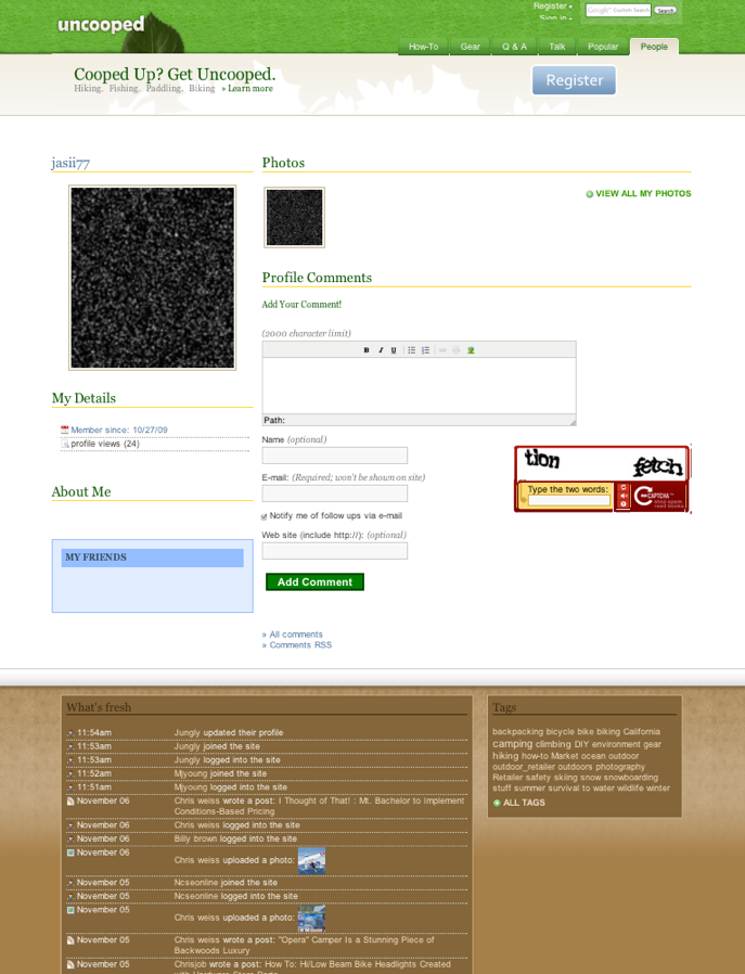
Uncooped is a site that uses the engine. The profile contains typical items – profile, blog posts, member details, a member photo, about me and comments.

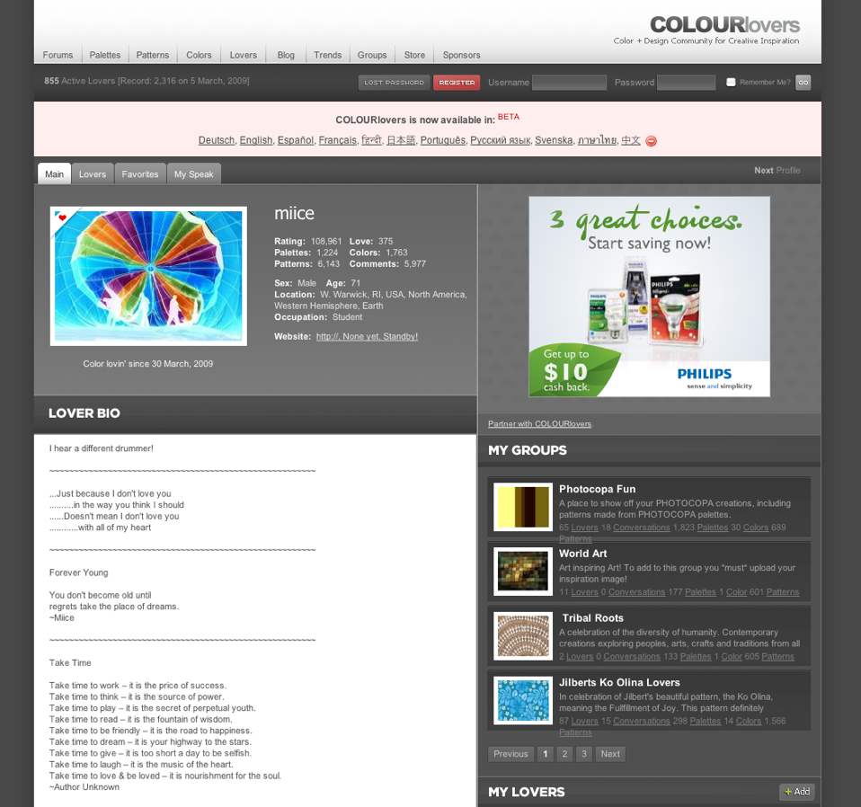
COLOURlovers focuses on the purpose of the site on the user profile. The user can express their colors, palettes and patterns. It will also list their comment,s groups and ‘lovers’ (friends). I think this is one of the better looking profiles which is expected since this is a site for designers.

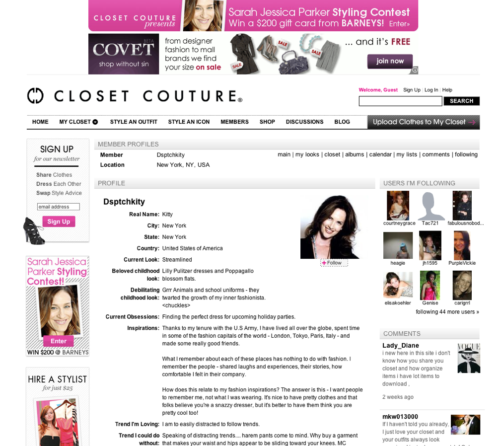
ClosetCouture is a fashion site. The profile reflects the niche listing the clothes in the users closet. It also contains standard following, comments and about me profile information.

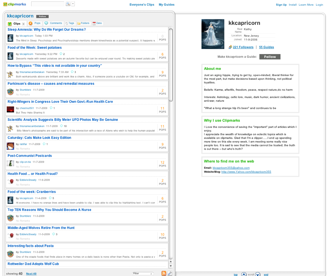
Clipmarks lists bookmarks from the user and gives them an about me space.

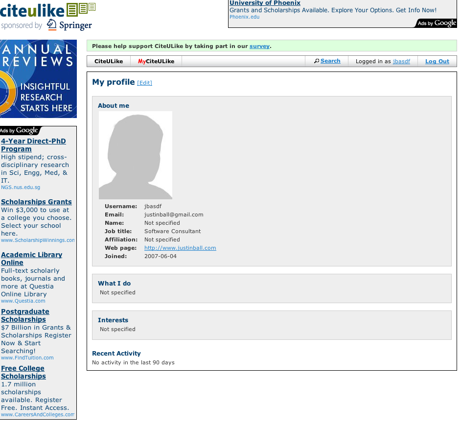
CiteULike contains academic references. Each user’s profile shows their references and their tags.

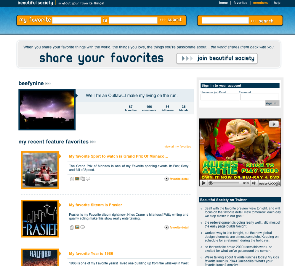
BeautifulSociety let’s users list their favorite stuff and includes a list of friends and followers.

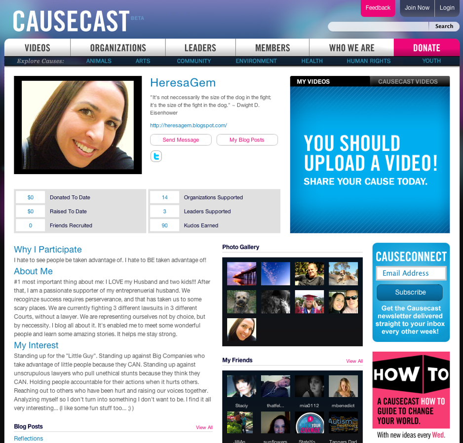
CauseCast is a niche network focusing on supporting non profit organizations. The user’s profile let’s them express their donations and why the participate. It also shows the user’s blog posts, photos and friends.

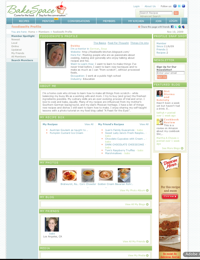
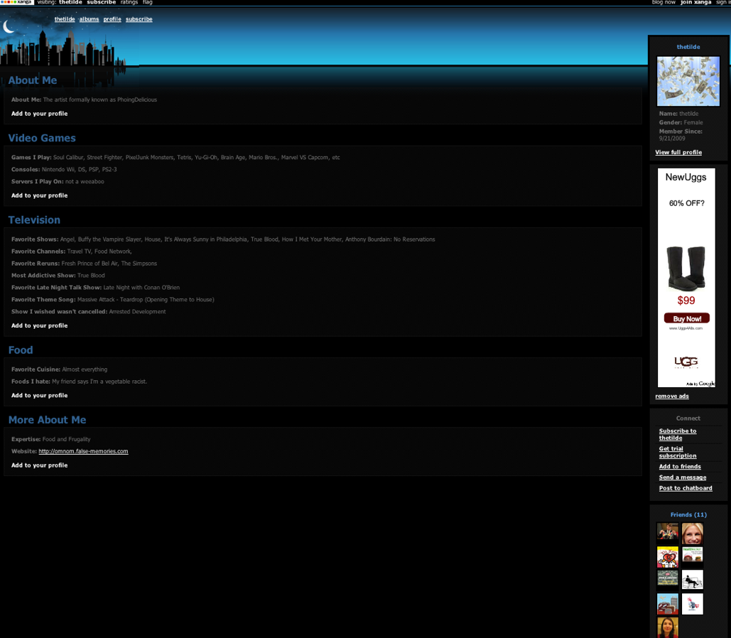
Bakespace is all about food. The profile is clean, but could focus on the food aspect of the site a bit more. There is a large about me space along with a recipe box, photos, blog and friends. There is also a ‘fridge’ which is basically a comment wall.

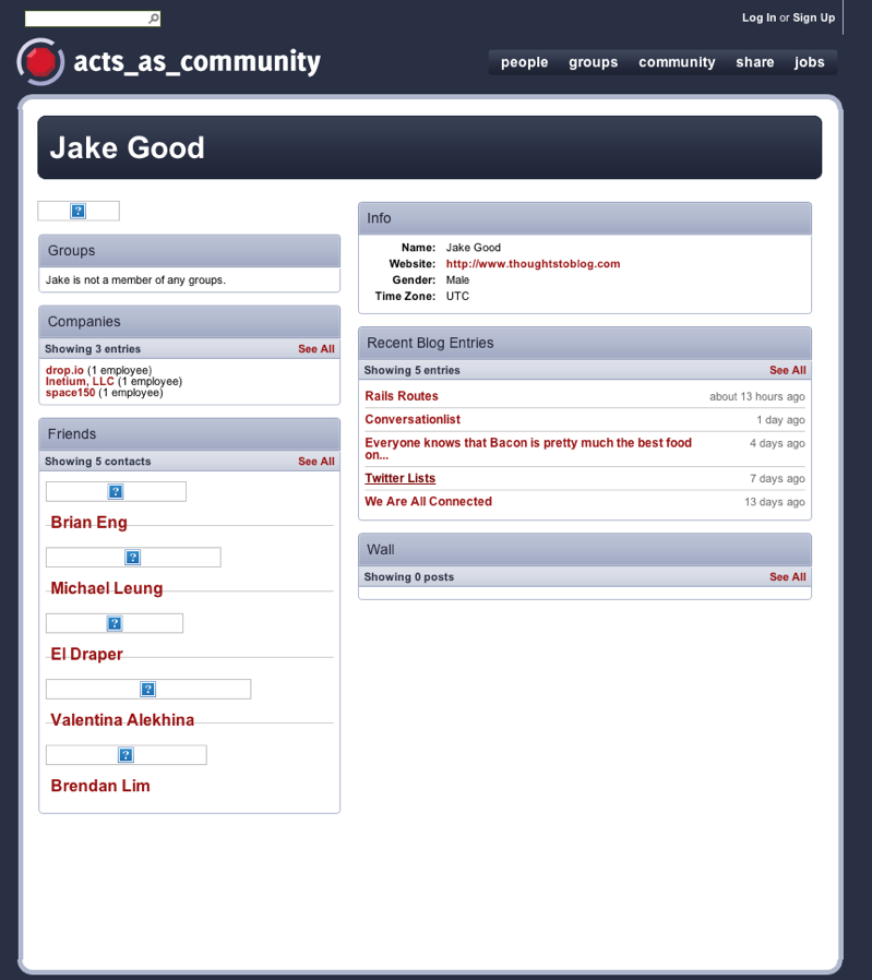
Acts As Community uses the standard boxes with content approach but they do a good job of making it look good.

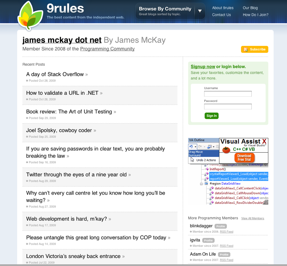
9Rules.com focuses on links. Each user’s profile reflects the links shared by that user.
